Table of Contents
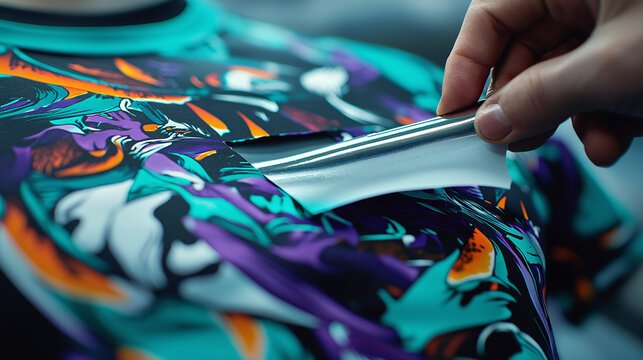
Getting those colors just right in DTF (Direct-to-Film) printing can feel like chasing a rainbow sometimes. One print looks fantastic, and the next? Meh—too dark, too dull, or totally off.
If you’ve ever pulled a fresh transfer from your heat press and thought, “That’s not the color I designed,” you’re not alone.
This guide is all about how to achieve accurate color in DTF printing—step by step, no jargon overload, just straight talk and practical tips. Let’s dive in!
Why Color Accuracy Matters in DTF Printing
Before we get into the how, let’s quickly touch on the why.
Color accuracy isn’t just about making pretty prints. It’s about:
- Brand consistency (think logos and business merch)
- Customer satisfaction (no one likes surprises—unless it’s cake)
- Professional quality (yes, you can compete with the big guys)
Now, let’s break it all down.
Step-by-Step Guide
1. Start with a Calibrated Monitor
If your screen is lying to you, your colors will be off from the get-go.
How to fix that:
- Use a monitor calibration tool like the X-Rite i1Display or Datacolor Spyder.
- Calibrate in the lighting conditions you usually design in.
- Recalibrate every couple of weeks—yes, monitors drift over time.
Pro Tip: Avoid working in super warm or cold lighting. Natural daylight is your best friend.
2. Use the Right Color Profile (ICC)
Your DTF printer, ink, and film combo needs the correct ICC profile to speak the same “color language” as your software.
Here’s what to do:
- Check if your ink or printer manufacturer provides an ICC profile.
- If not, consider creating a custom one using a spectrophotometer (pricey but worth it if you’re serious).
- Load the profile into your design software (Photoshop, Illustrator, RIP software).
ICC profiles = the secret sauce to accurate color output.
3. Design in RGB, But Export Correctly
DTF RIP software typically wants RGB files, but not all RGBs are created equal.
Do this:
- Design in Adobe RGB or sRGB (based on your ICC profile).
- Avoid using CMYK unless your RIP specifically asks for it.
- Export as PNG or TIFF—JPEG can compress and distort color.
4. Choose High-Quality Ink & Film
Not all DTF supplies are created equal. Cheap inks and film can sabotage even the best color management.
Look for:
- Inks designed specifically for DTF (not repurposed DTG inks).
- Film with a smooth, even coating.
- Brands with good reviews from pros and hobbyists alike.
If your prints always have a greenish or reddish hue—your ink might be the culprit.
5. Print a Color Chart
This step is a game-changer.
Here’s how:
- Download a standard DTF color chart (many suppliers offer one).
- Print it with your current settings.
- Compare the printed colors to your screen.
From here, you’ll know exactly what color tweaks you need to make in your design files to match the printed output.
Seeing is believing—color charts help bridge the gap between digital and physical.
6. Tweak RIP Software Settings
Your RIP software controls how ink is laid down. This affects everything from vibrancy to saturation.
Adjust the following:
- Ink limits (too much ink = muddy colors)
- Color adjustments (some RIPs let you tweak reds, blues, etc.)
- White ink underbase strength (too much white can mute colors)
Small changes here can make a huge difference on the final print.
7. Maintain Your Printer Regularly
Color consistency depends on your hardware being in tip-top shape.
Keep up with:
- Daily nozzle checks and head cleans
- Shaking white ink bottles (prevents pigment settling)
- Storing ink at proper temperatures
An unmaintained printer = color roulette.
Bonus Tips for Better Color Accuracy
- Test, test, test. Never go straight to bulk printing without a test print.
- Keep detailed notes. Track what settings you used for great results.
- Stay consistent. Changing ink brands mid-project can throw everything off.
FAQs
Q: What if my colors still look off after doing everything right?
It could be your heat press. Too much heat or time can dull or discolor the transfer. Try adjusting the press settings slightly.
Q: Can I just eyeball the colors and skip ICC profiles?
You can, but you’ll be guessing every time. ICC profiles take the guesswork out of the process and save you time and materials.
Q: Do I need expensive equipment for color accuracy?
Not necessarily. A good monitor, the right ICC profile, and quality supplies can get you 90% of the way there. Calibration tools are great but optional for beginners.
Q: Why do my prints look different from screen to shirt?
It’s the combo of screen calibration, color profile, ink limits, and heat pressing. Tuning each of those steps will bring screen and print closer together.
Q: How often should I reprint a color chart?
Anytime you change inks, film, RIP software, or notice colors drifting. It’s a quick way to recalibrate your expectations.